
Taco Tote Rebrand






Click here to view Branding Guide
Click here to view Case Study
Overview:
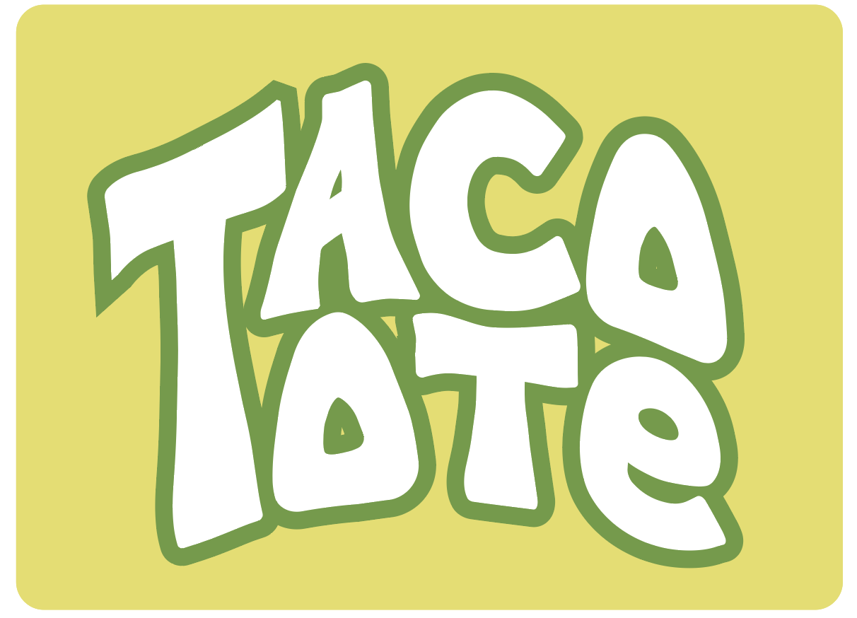
This mock rebrand for Taco Tote focuses on redefining the restaurant’s visual identity to reflect its authentic, handmade Mexican cuisine while appealing to modern audiences. The goal was to replace the bright, playful visuals of the original brand with a warm, cohesive system rooted in tradition and freshness.
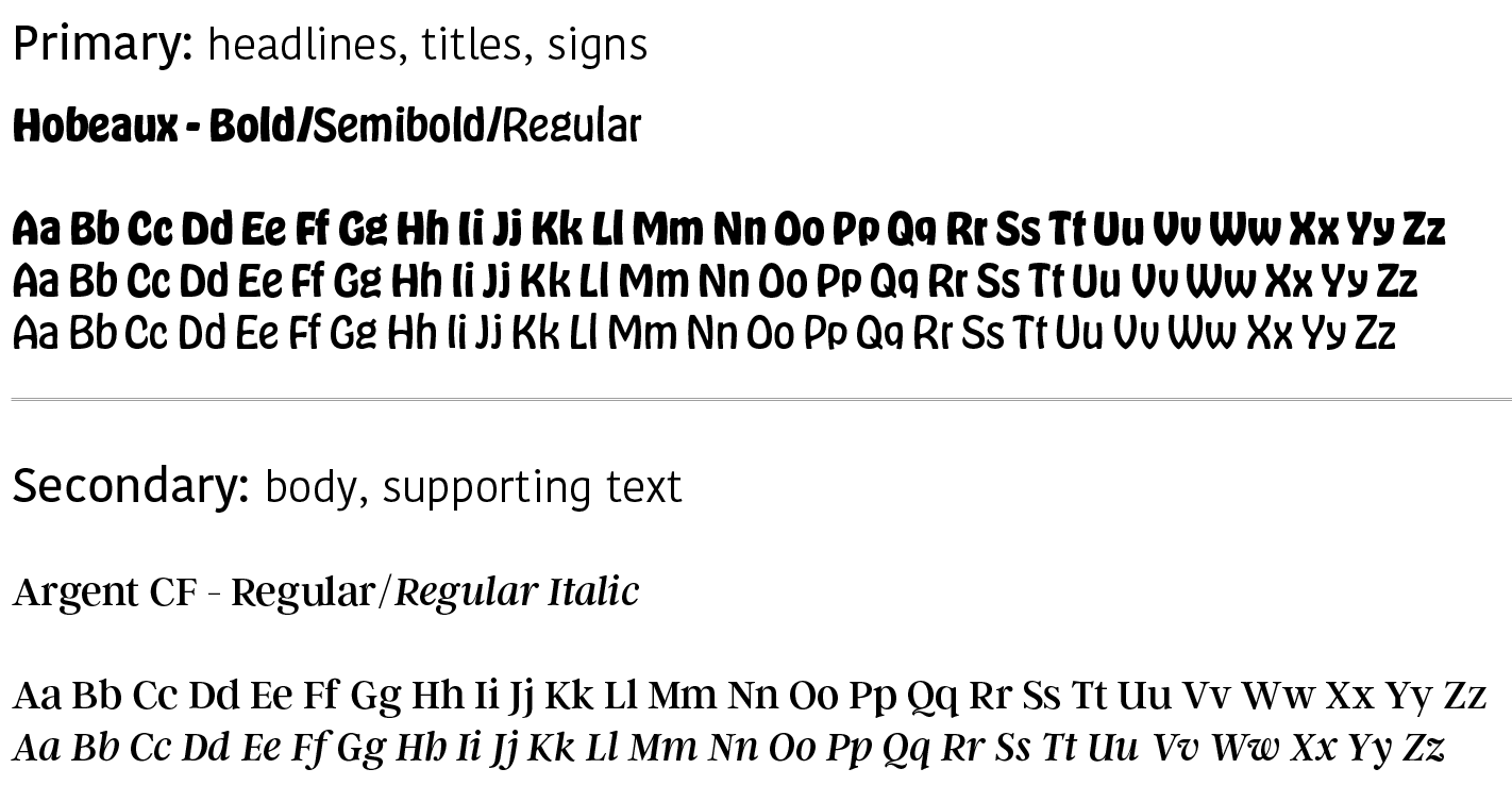
The rebrand includes a redesigned logo, refined color palette, typography system, patterns, graphic elements, web icons, and photography direction—all unified in a comprehensive brand guide. Each element was carefully crafted to balance authenticity with approachability: the logo’s rounded forms and natural colors convey warmth, while modern typography ensures clarity and versatility across applications. The color palette draws inspiration from traditional Mexican dishes, and the custom patterns reference Falsa blankets and hand-drawn motifs to create a rich, culturally grounded identity.
Collateral designs, including a flyer, menu, t-shirt, and stationery, demonstrate how the new brand system functions consistently across print and digital platforms. Adobe Illustrator was used for logo and element design, Photoshop for photography and mockups, and InDesign for the final branding guide layout.
Software Used:
Adobe Illustrator
Adobe Photoshop
Adobe InDesign
Results:
A cohesive rebrand that captures Taco Tote’s authentic spirit through color, texture, and storytelling. This project strengthened my understanding of how research, consistency, and visual strategy work together to build a meaningful, recognizable brand.